


Learn how Agile teams track progress, spot problems early, and stay on course using smart, simple metrics like burndown charts, flow data and team feedback.

To find signals in data, we must learn to reduce the noise.
Stephen Few – Data Visualization Guru
Key terms
Vanity metrics: Numbers that look good but don’t actually help you make decisions or improve the project.
Velocity: The number of story points a team completes in a sprint, used to help forecast future progress.
Story points: A simple way to estimate how much effort a task will take by comparing it to other tasks, without using hours or days.
Lead time: The total time it takes from when a task is requested to when it’s completed and delivered.
Cycle time: The time it takes to complete a task once the team starts actively working on it.
Throughput: The number of tasks a team finishes in a certain time period, used to measure team capacity and progress.
Burndown chart: A simple line chart that shows how much work remains in a sprint and whether the team is on track to finish it.
Escaped defect: A bug or issue that wasn’t caught during testing and was found only after the work was released.
Blocked time: The amount of time a task spends stuck and unable to move forward due to a problem or dependency.
Aging work: A task that’s been sitting in progress for too long, often signaling that it’s stalled or unclear.
Flow efficiency: A measure of how much time work is actively being done versus waiting around in the process.
8.6.1: Agile metrics that matter
If you’ve ever been in a project meeting where someone proudly announced how many emails they sent or hours they logged, you’ll know that not all metrics are helpful. In Agile, we take a different approach. Metrics are meant to help teams learn, improve, and deliver value, not to tick boxes or show off busywork.
Even the word “metrics” can make people flinch. It sounds like paperwork, spreadsheets, and – worst of all – math. That’s not the vibe we’re going for here.
In fact, you’re right to be wary of vanity metrics.
A vanity metric is a number that looks impressive but doesn’t actually tell you anything useful. Examples include:
- Total number of meetings held (cool… but did anything come out of them?)
- Lines of code written (more is rarely better)
- Tasks started (finishing is what matters)
Vanity metrics create a false sense of progress. They can also pressure teams into looking busy instead of delivering value.
In complex, fast-changing environments, you need just enough visibility to know:
- Are we consistent?
- Are we improving?
- Are we getting stuck?
- Are we working at a sustainable pace?
Good metrics help answer those questions, without needing to build a dashboard that looks like a NASA launch terminal.
For that reason, a useful metric should:
- Focus on outcomes, not just activity
- Be easy to track and explain
- Encourage reflection, not blame
- Help with decision-making
If a metric doesn’t spark a conversation or lead to a useful insight, it’s probably just noise.
Agile doesn’t mean ignoring numbers, but it also doesn’t mean drowning in them.
Start small. Track a couple of metrics that reflect how your team works and use them to guide regular check-ins.
If a number feels off, ask why. If a trend improves, talk about what changed. The point is learning, not reporting.
In the next lesson, we’ll take a closer look at some flow-based metrics and how to use them in your planning and delivery.
8.6.2: Flow and forecasting
In Agile projects, it’s easy to focus only on what’s next in the backlog or what’s happening in the current sprint. But zooming out every so often and looking at how work is flowing through the team can be just as valuable.
That’s where flow metrics come in. These are simple numbers that help teams answer big questions like:
- Are we getting faster or slower?
- Where are things getting stuck?
- How much can we realistically commit to next time?
And no, you don’t need complex dashboards or spreadsheets. Just a few consistent data points and a bit of team reflection can go a long way.
Velocity: How fast does your team usually go?
Velocity is one of the most common Agile metrics. It tracks how many story points your team completes in a sprint. Over time, this helps build a picture of what your team can deliver in a typical sprint.
Let’s say your last four sprints finished with 17, 18, 16, and 19 points. That gives you an average velocity of about 17.5 points. If the next sprint’s work is estimated at 35 points, you know you’ll likely need two sprints to finish it.
But here’s the key:Velocity is for forecasting, not performance reviews. It’s not a target. It’s not a competition. It’s just a helpful average to support planning.
And it only works if you estimate story points consistently and don’t fudge the numbers to look productive.
Lead vs. cycle time
These two often get confused, but they tell slightly different stories.
- Lead time is the total time from when work is taken out of the backlog or into a sprint to when it’s delivered.
- Cycle time is how long something takes once you actually start working on it.
Imagine a ticket sits in “To Do” for a week before anyone picks it up. Then it spends three days in “In Progress” and gets finished. The lead time is 10 days. The cycle time is 3.
Both are useful:
- Long lead times may suggest slow prioritization or too much work-in-waiting.
- Long cycle times may suggest blockers, unclear tasks, or over-commitment.
Shorter isn’t always better, but understanding the difference helps teams make smarter adjustments.
Throughput
Throughput measures how many items your team completes in a given timeframe, like 15 tasks per week or 60 cards per month.
Unlike velocity, throughput isn’t based on story points, it just counts tasks.
It’s useful when:
- Your work doesn’t use story points
- You want to spot trends (e.g. are we consistently finishing 10–15 items per sprint?)
- You’re tracking value delivery over time
Once again, though, more isn’t always better. Ten meaningful, high-value features are often better than 20 quick wins with little impact.
How to use these metrics
You don’t need to track every metric all the time. Pick the ones that help your team understand how work is flowing, and check them regularly.
Some easy ways to get started:
- Use timestamps on your board to calculate lead and cycle time
- Look at your “Done” column at the end of each week to count throughput
- Plot velocity over several sprints and look for stability
Then, talk about what you see. Not to assign blame, but to improve.
If lead times are growing, maybe you need to tighten up prioritization. If cycle time is creeping up, maybe there’s a hidden blocker.
Used well, flow metrics help you plan better, respond faster, and improve steadily over time.
In the next lesson, we’ll introduce burndown charts, a simple visual that show how your team is tracking toward its goals.
8.6.3: Spotting trouble – burndown charts
Agile is flexible by design, but that flexibility only works when it’s intentional. Good Agile delivery means knowing when and where to flex, and spotting when things are starting to drift off track.
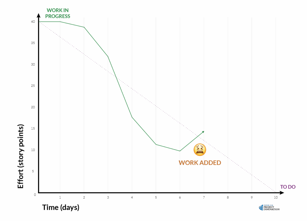
A burndown chart is a simple visual that shows how much work remains in a sprint over time. It helps teams track progress toward the sprint goal and quickly spot if things are going off course.
Let’s walk through an example:
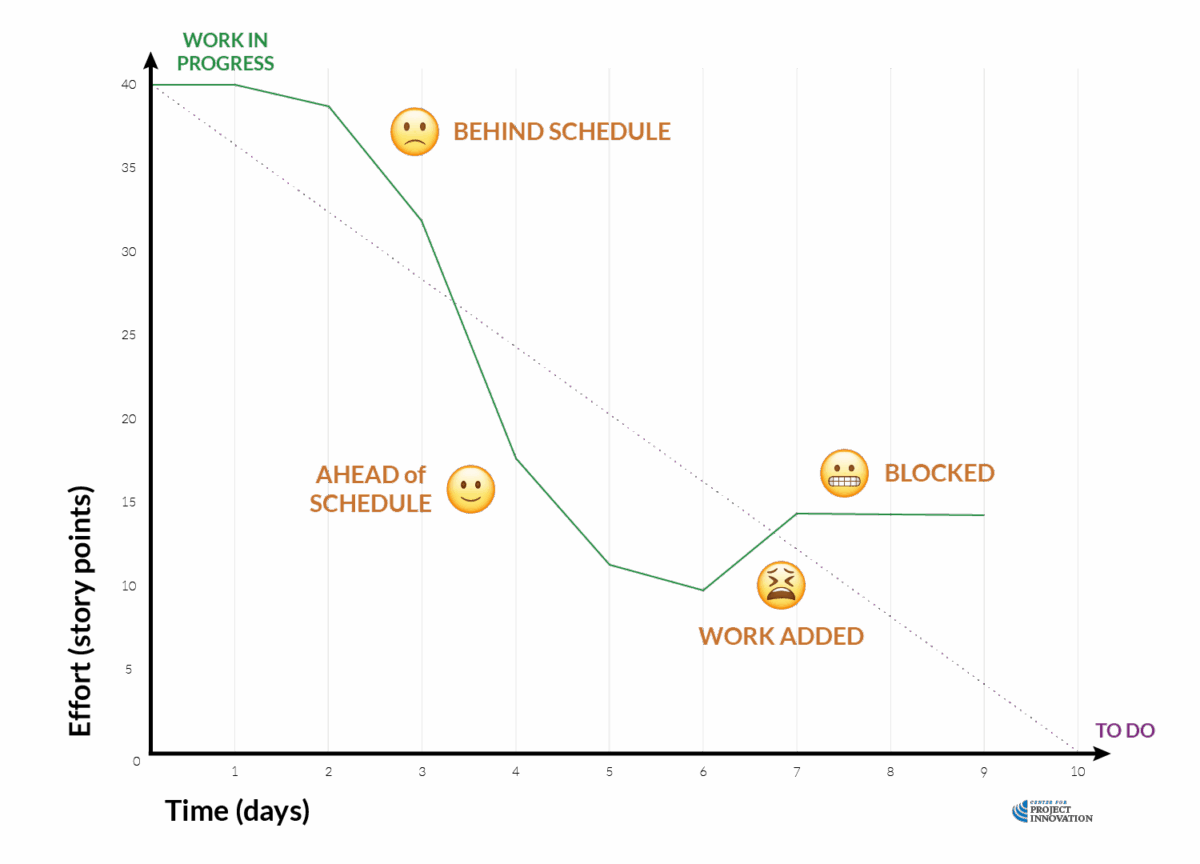
Y-axis (Effort in story points): Shows the total estimated effort remaining in the sprint. This can also be expressed as the number of tasks or planned hours.
X-axis (Time in days): Shows the time span of the sprint, from Day 0 to Day 10.
Purple dotted line: The ideal burndown line, showing a hypothetical smooth and even path to completing all work by the end of the sprint.
Green line: The actual progress of work being completed over time.As the team completes tasks, the line goes down, ideally toward zero by the end of the sprint.
Here’s what’s happening:
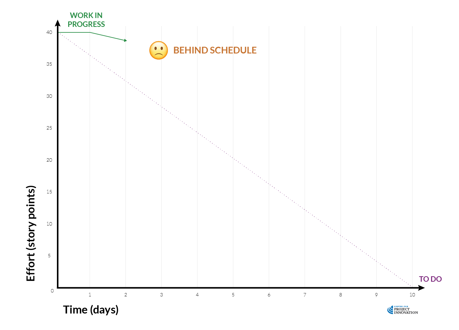
Days 1-2
Work has started slowly—the line barely moves. This could mean onboarding, setup, or unplanned delays.
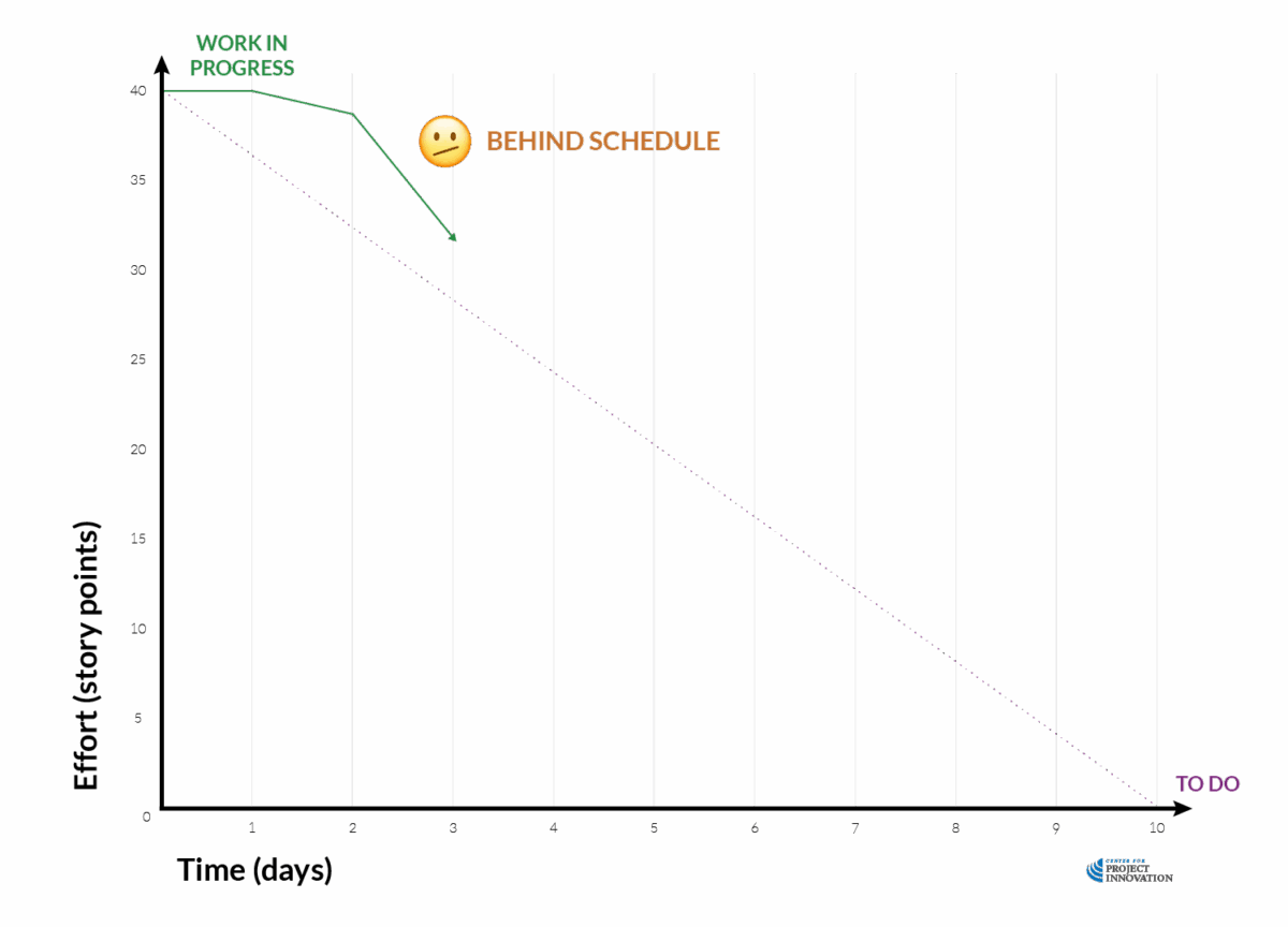
Day 3
Progress picks up. The team is working through the backlog and catching up.
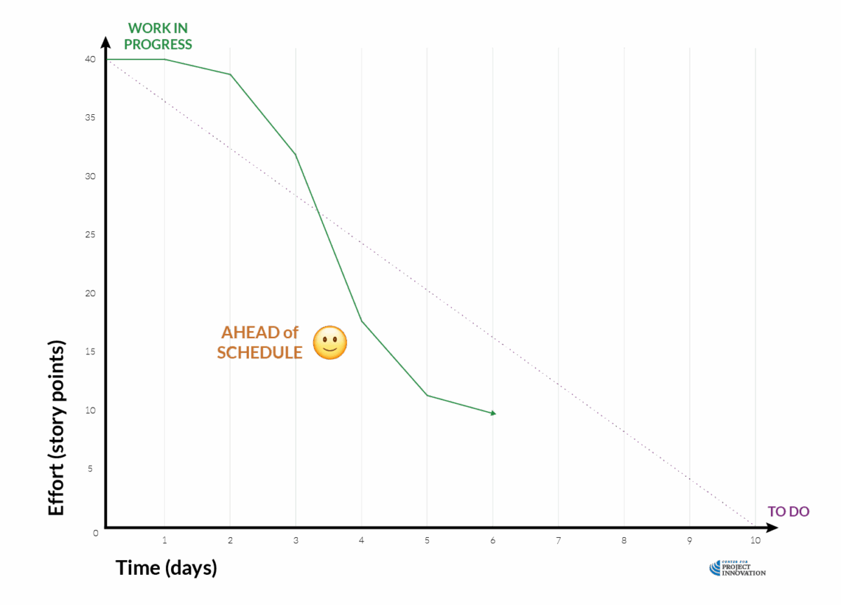
Days 4-5
The team is ahead of schedule—things are moving well.
Day 6
More work is added mid-sprint. This is sometimes necessary, but it should trigger a discussion: is it new scope, missed planning, or something else?
Day 8
The line flattens. Work isn’t progressing. This is often a sign of blocked tasks, conflicting priorities, or lack of clarity.
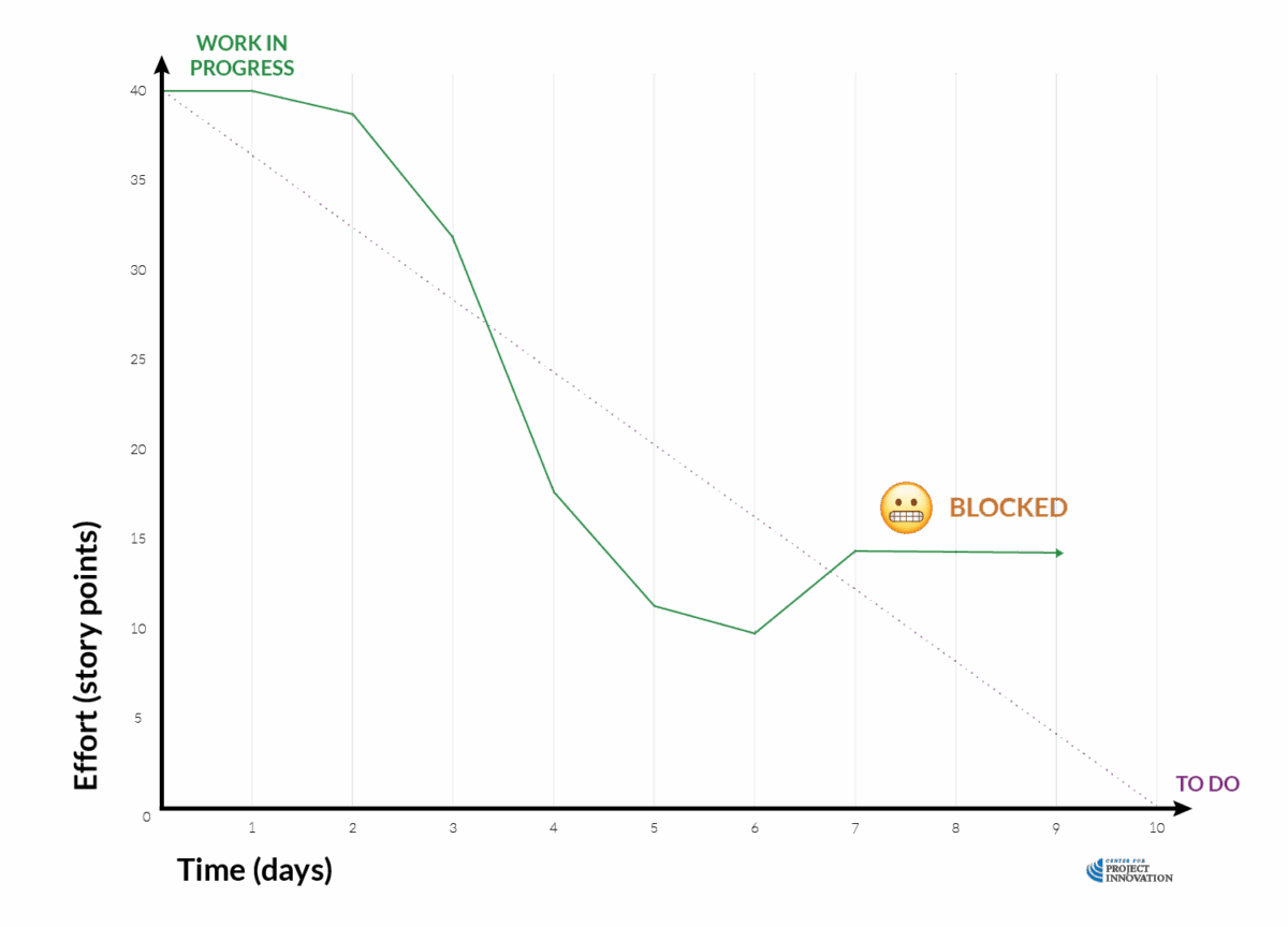
As you can see, a burndown chart is one of the simplest ways to check if your sprint is on track. If the line is dropping steadily, great.
If it’s flat—or barely moving—you’ve likely hit a blocker, underestimated complexity, or overcommitted. If that’s the case…
- Ask: What’s stuck? Who needs help? Is the work too big?
- Revisit WIP limits and use your daily stand-ups to catch issues earlier
- Consider breaking down large stories for future sprints
And if our green line rises, more work’s been added after the sprint began (something to avoid unless agreed).
Importantly, burndown is about progress, not performance.
It shows how much work is left, not how well that work is being done.
After all steep drop doesn’t mean high quality.
And a flat line doesn’t mean poor effort.
That matters because focusing only on speed can lead to cutting corners. For that reason, burndown charts should raise questions, not pressure:
- Are we doing the right things?
- What’s slowing us down?
- Do we need help, resources, or clarification?
In other words, they’re a conversation starter, not a scoreboard.
Agile doesn’t expect perfect lines. Instead, it expects you to respond when things go off the plan.
Burndown charts give you a clear window into whether your team is delivering or dragging.
In the next lesson, we’ll explore additional Agile metrics that help teams reflect on quality, confidence, and health, because progress alone isn’t enough.
8.6.4: Quality, confidence, and team health metrics
So far, we’ve focused on how fast work moves and how much value gets delivered. But there’s more to project health than just output.
Agile is also about quality, confidence, and team sustainability, because burnout and bugs don’t belong in your definition of success.
In this lesson, we’ll look at some of the metrics that aren’t always tracked in tools, but tell you a lot about how things are really going.
Escaped defects
An escaped defect is a bug or issue that makes it into the hands of users after something was released. It’s a backward-looking quality check, and a very useful one.
If the number of escaped defects is going up, that’s a signal. Maybe your definition of done isn’t clear. Maybe testing is being skipped or done too late. Maybe you’re under pressure and rushing things out the door.
Once again, this metric isn’t about blame. It’s about asking better questions:
- Are we catching issues early enough?
- Are we solving the right problems, or just delivering fast?
- Do we need to revisit how we test, review, or involve users?
Blocked time and aging work
Work that’s started but not finished is normal—but when it sits for too long, it becomes a warning sign.
We call this blocked time—the amount of time a task is actively stuck, waiting on something else. But whether it’s labeled “Blocked” or just quietly lingers in “In Progress,” the impact is the same: it clogs the system and hides inefficiencies.
These aging tasks are often the work no one wants to touch. Maybe it’s unclear. Maybe someone’s overloaded. Maybe it’s dependent on external input that hasn’t arrived. Whatever the reason, stuck work is risky work.
Make it a habit to check blocked or aging tasks regularly:
- Has this been sitting too long without progress?
- Does someone need help or clarification?
- Is it still relevant, or should we split it, reassign it, or remove it?
The longer work sits, the more likely it is to need rework or be forgotten entirely. Surfacing blocked time helps you fix flow problems before they snowball.
Flow efficiency
Flow efficiency compares the time spent actively working on a task to the total time it’s been in progress.
Here’s the basic formula:
Flow Efficiency = (Active Time ÷ Total Time in Progress) × 100
So if a task was started 10 days ago but only had 3 days of actual work done on it, your flow efficiency is 30%.
This helps answer:
- Are we keeping things moving?
- Are there too many handoffs or approval delays?
- Do we need to rethink how work is assigned or reviewed?
You don’t need to chase a perfect number. Just look for patterns and opportunities to improve.
Don’t skip the human metrics
A confident, supported team is a productive one. That’s why simple pulse checks—like a 1–5 confidence vote during sprint planning or review—can reveal more than any chart.
You might ask:
- How confident are we that we’ll deliver this sprint?
- How clear are we on what we’re doing?
- Are there any risks we’re not talking about?
Tracking team satisfaction or confidence over time helps you spot morale dips, communication issues, or hidden uncertainty before they affect delivery.
None of these metrics are about performance policing. They’re about visibility. The goal is to use them as starting points for improvement, not scoreboards.
When your team sees metrics as a shared resource (as opposed to a report card), they’re more likely to engage, reflect, and change how they work.
And these insights aren’t just useful during delivery. They’re key to closing Agile projects well. Metrics like blocked time, flow efficiency, and escaped defects help you look back with clarity, so you can identify what worked, what didn’t, and where to improve next time.
In the next topic, we’ll look at how Agile projects actually end: what closing looks like without a handover binder, and how to wrap up your work without losing the momentum—or the lessons—you’ve gained.
